Tutor Marketplace Redesign
Parents needed to trust a tutor before booking. The page made that impossible.
The problem
No usability, no trust, no system
The marketplace had no accessibility, no visual consistency... But the real problem ran deeper: parents couldn't find the information they needed to feel confident booking a tutor for their child.
The decision
Build a pattern, not just a page
I started with existing data and SEO requirements, but quickly expanded the scope. Instead of fixing individual screens, I designed prioritising legibility, trust signals and clarity. Many elements were deliberately cut for the MVP to ship something clean and measurable first.
The result
New pool of tutors and tutor profiles that can be measured and improved
The redesign established the first reliable baseline for the marketplace.
Challenge
A marketplace parents can trust
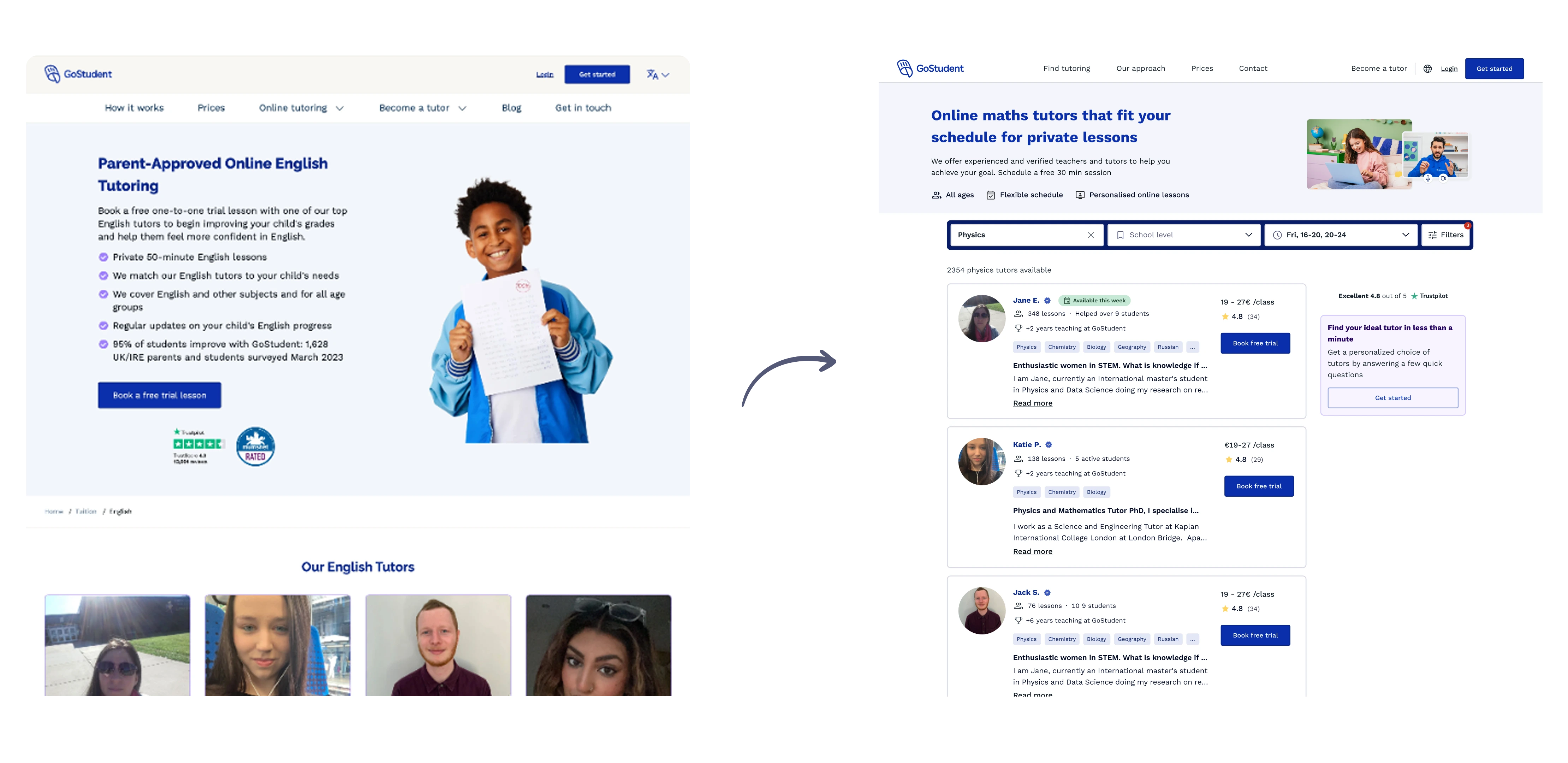
The existing marketplace was built without a parent in mind. Tutor cards showed limited information, profiles felt too academic ... Parents who landed on the page had no clear way to evaluate tutors or feel confident enough to book a trial class for their child.
The SEO team's request to restructure the pages opened the door to redesign everything else.
What I did
From a broken page to a reusable system
- Started with data and SEO requirements to identify structural opportunities
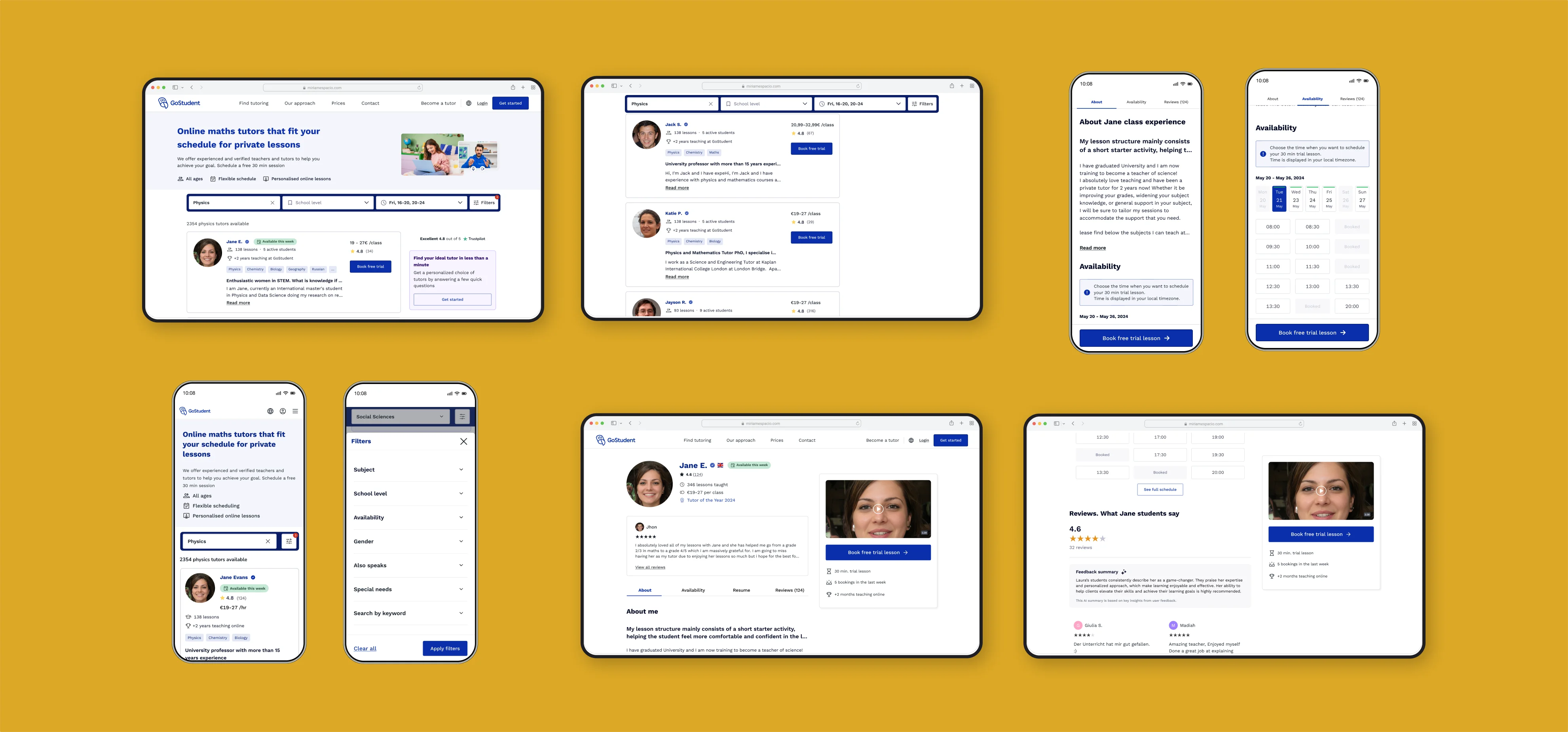
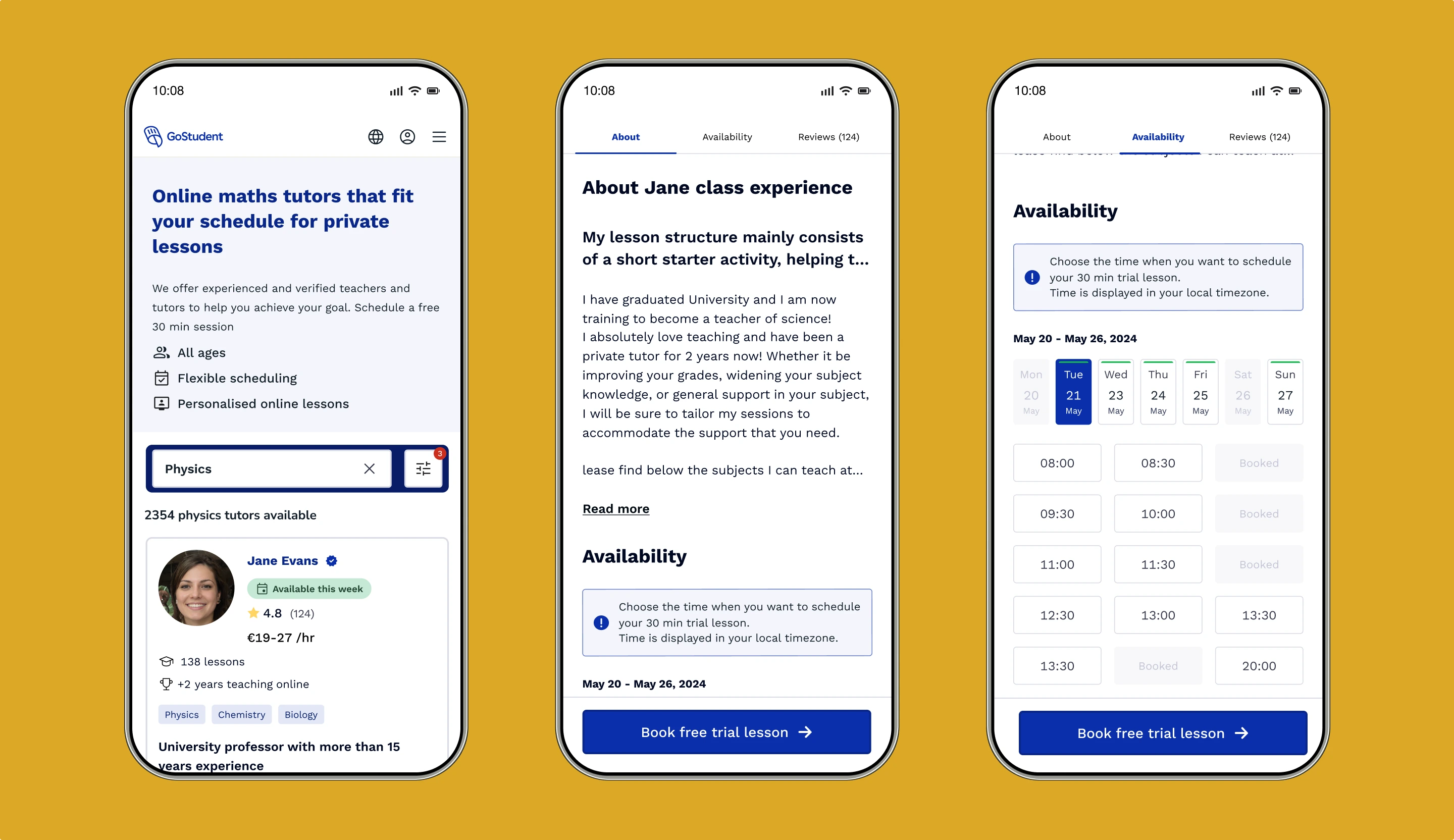
- Designed a reusable tutor card pattern with the information parents needed: reviews, availability, lessons taught, subjects and a more personal tone
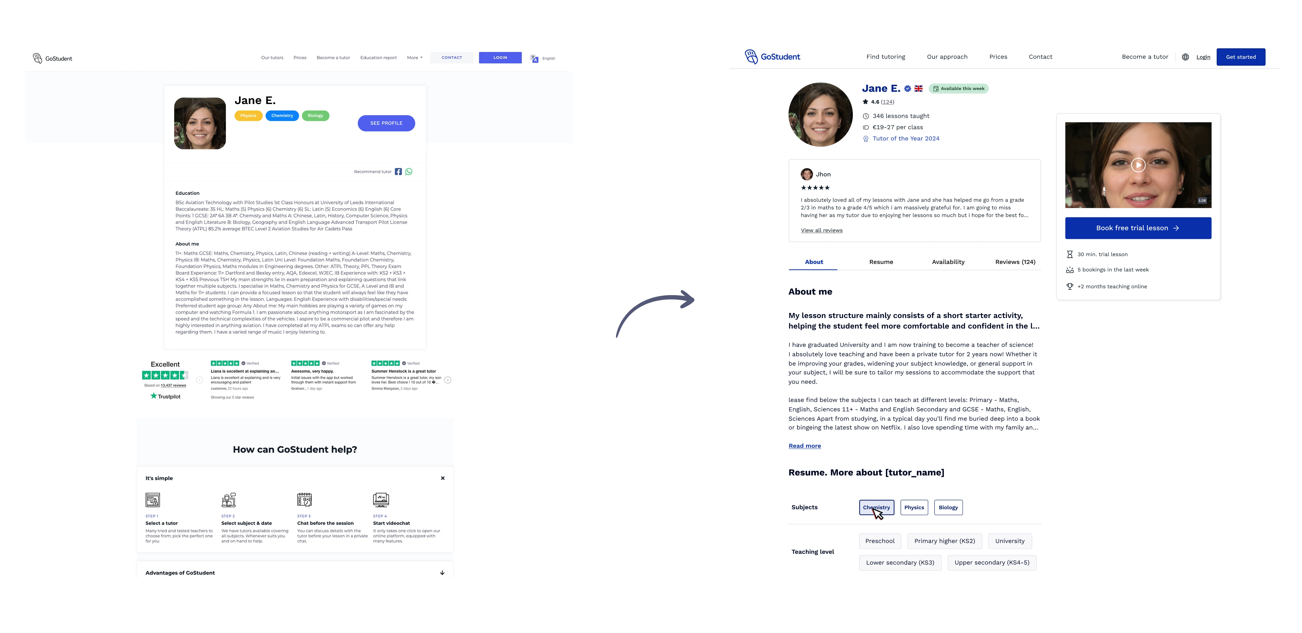
- Rebuilt the tutor profile prioritising trust: video introduction, personal details, education background, reviews summary and hobbies to help parents and children connect
- Shipped an MVP cutting elements that needed more validation: in-grid calendars, advanced sorting, price transparency
- Conducted unmoderated qualitative research with parents six months after launch to understand what was still blocking bookings
- Iterated based on findings: added spoken languages, FAQs on the tutor profile, hobbies, a reviews summary and more personal copy
Research
What parents actually needed to book
After the first release I needed to understand what was blocking leads. The research goal was to understand user needs, expectations and usability, specifically what was missing in tutor profiles to help parents make a confident choice.
Three research questions guided the study: what parents expect to find in a tutor profile, how they evaluate trustworthiness and credibility, and whether the current design aligned with those expectations. Key findings and a screenshot of the final report after processing raw data:
- Parents skip tutors with no reviews, without hesitation.
- 5 of 10 users wanted to sort by reviews or ratings and couldn't.
- Profiles felt too academic. Parents wanted personality, hobbies, personal details, something that helped them imagine their child connecting with the tutor.
- Pricing felt vague. Parents wanted clarity on actual cost before committing.
Key decisions
Ship small, learn fast. Relaunching an MPV.
The first version cut everything that wasn't essential to make parents feel confident enough to book, as the goal was to launch something clean, establish a baseline and iterate from real usage data.
Match user needs with product constraints
Research revealed what parents wanted, but not everything could be changed. Some elements conflicted with other parts of the product.
Surface every trust signal that drives a booking
Interviews showed parents make decisions based on trust, not credentials. Reviews summary, video introduction,... and personal tone were all added because research proved they moved parents closer to booking.
Impact
A measurable baseline for the first time
The redesign replaced an unmeasurable page with a system that could be tracked, iterated and improved. Six months of real usage data informed revealed:
Before the redesign, there was nothing to measure. After it: 13–20% lead-to-customer on the flow, +11% direct bookings, and 80% of parents who book a trial complete it, already trusting who they'll meet.
What's next
Second research cycle in progress
Almost eight months after the first iteration, a new ideation workshop with stakeholders is underway to define what to test next. Hypotheses will be validated with real data before any design decisions are made.
The process mirrors what worked the first time: understand first, design second.